Grasshopper is a well-established female oriented fashion brand based in Slovakia.
Our job was to redesign the original brand that has been in use for over 10 years and was outdated. We kept the name of the brand, the “jump” symbol placed inside a solid circle, and the main colour. Everything else has been upgraded to better showcase the brand’s constant adjustment to current trends which is so critical to any female fashion brand’s success.
Project
Grasshopper Logo & Brand Design
Client
GRASSHOPPER s.r.o., Slovakia, EU
What We Did
Logo & Brand Redesign
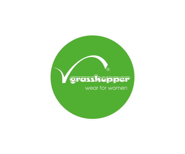
Logo Comparision
Compare the design of the original and updated logo
Original Logo
The biggest weaknesses of the old logotype were the outdated, childish looking font that didn’t match the overal look of the logo, the random use of white space and overly complicated design.
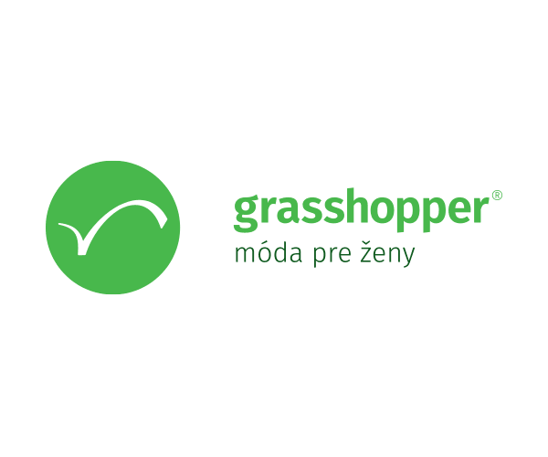
Upgraded Logo
Our client persisted on keeping the circle shape, the grasshopper “jump” symbol and the green colour to keep some consistency within the brand.
We have slighly adjusted the shade of green to make it look more fresh, used a brand new stylish type that looks good and is easy to read, and added extra white space to bring more air into the design.
Empowering young generation
of women through fashion


