Deliverables
Logotype & Symbol
Slogan
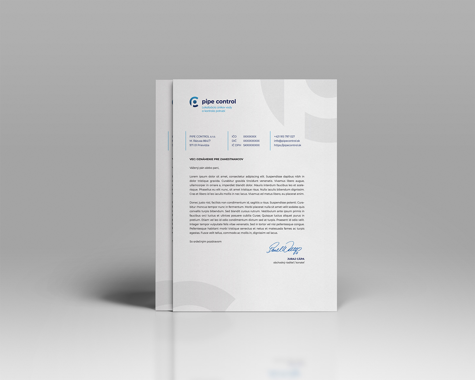
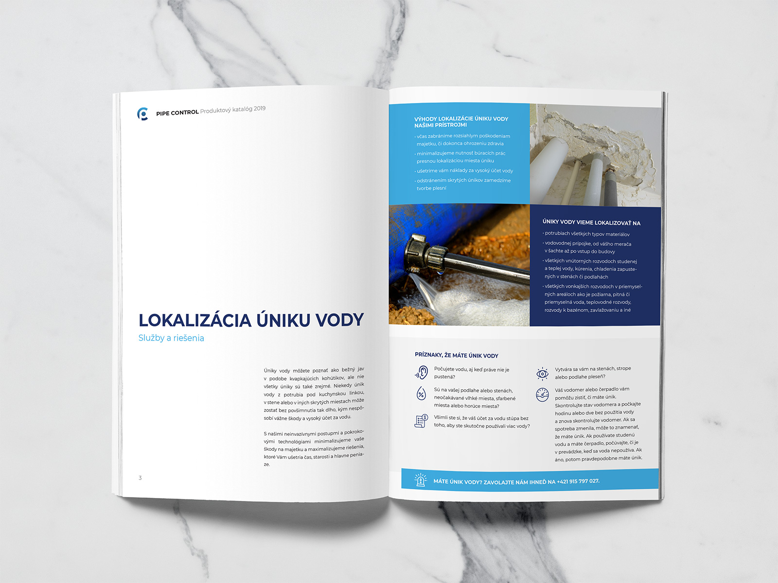
Design Manual
Website
Logotype & Symbol
Slogan
Design Manual
Website
Pipe Control
PIPE CONTROL s.r.o.
Slovakia (EU)
2019
Pipe Control is a new company established to help protect Earth’s natural resources, especially water, by preventing and fixing industrial pipe leakage.
The client had a vivid vision for the brand, so our aim was to embrace the vision while using our creativity to create a brand that’s impactful and easy to remember.
For the typeface, we have decided to use a lower-case bold sans-serif font type, skewing it to 95% width to create a better circular shape of round letters that better fit the symbol of the logotype.

Our final choice was Montserrat Bold, which we have aligned horizontaly with the symbol, setting the subtitle directly below it.
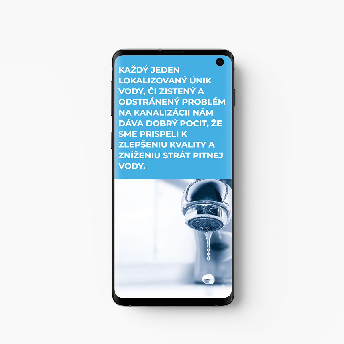
Our client came to us with the vision of using a combination of light blue and dark blue colors.
This combination made sense since the company’s main focus is preventing water leakage, so we have fully embraced it.
It took us a few tries to find the exact combination of blue shades that was impactful, but when we found it, we knew it rightaway. It felt just right.
#fff
#42aee3
#223268
#000
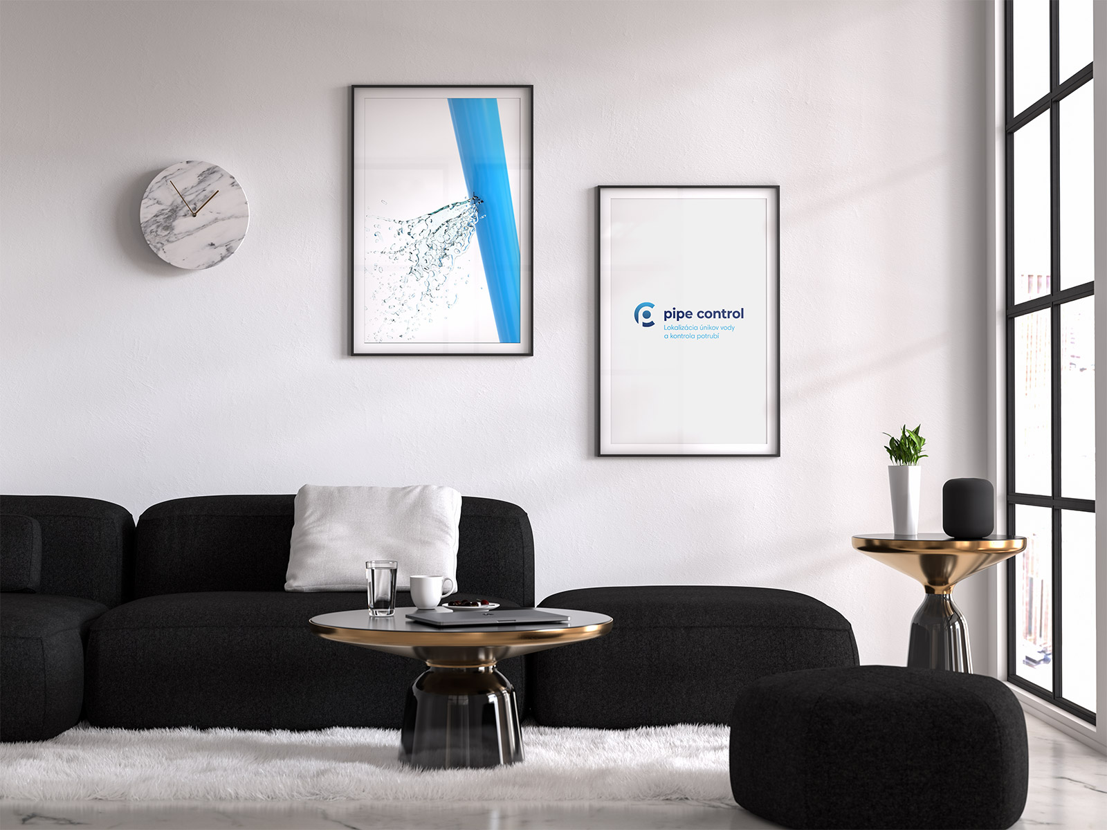
The final logotype is a combination of the circular symbol, the company’s name and the description of the company’s main focus.
The gentle gradient on the symbol is a simple stylistic detail that many might not even notice, yet it is there, making the symbol a little more friendly.
Montserrat Bold is used to create eye-catching headlines in web banners, advertisements and similar applications.
Montserrat Regular is the default font type for regular texts, both in the print and on the web.
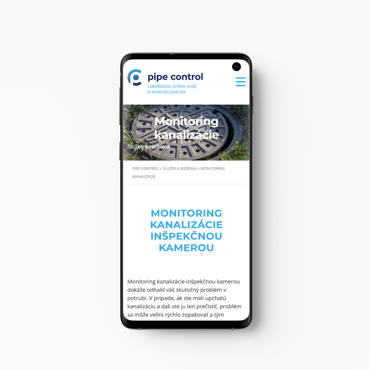
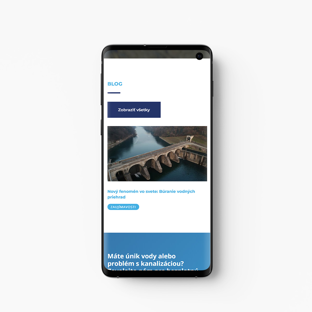
The website is a simple presentation of the company’s values, vision and solutions to problems of the particular target market.
Of course, the website is optimize for the best viewing experience on desktop, tablet and mobile.
”I have decided to collaborate with Lubo from Brandbonsai.com based on his previous work, which made me intrigued right away. He is a professional and even though I was worried about the long-distance communication, our collaboration couldn't have been better.
Juraj CápaCEO of PIPE CONTROL s.r.o.

© 2007 - 2024 Design & Development Agency Brandbonsai


